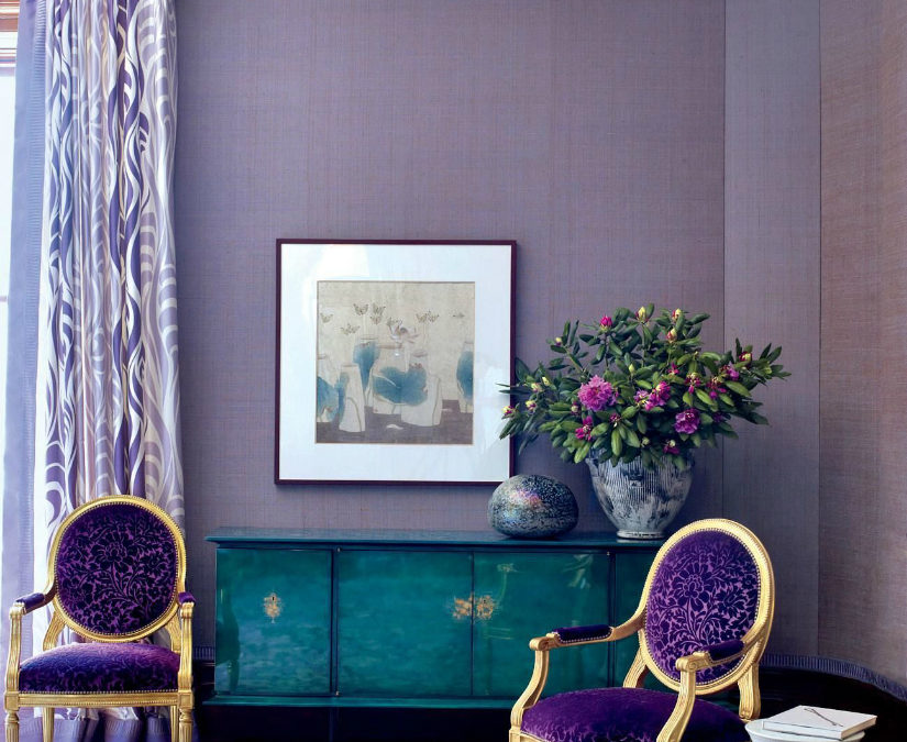
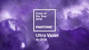
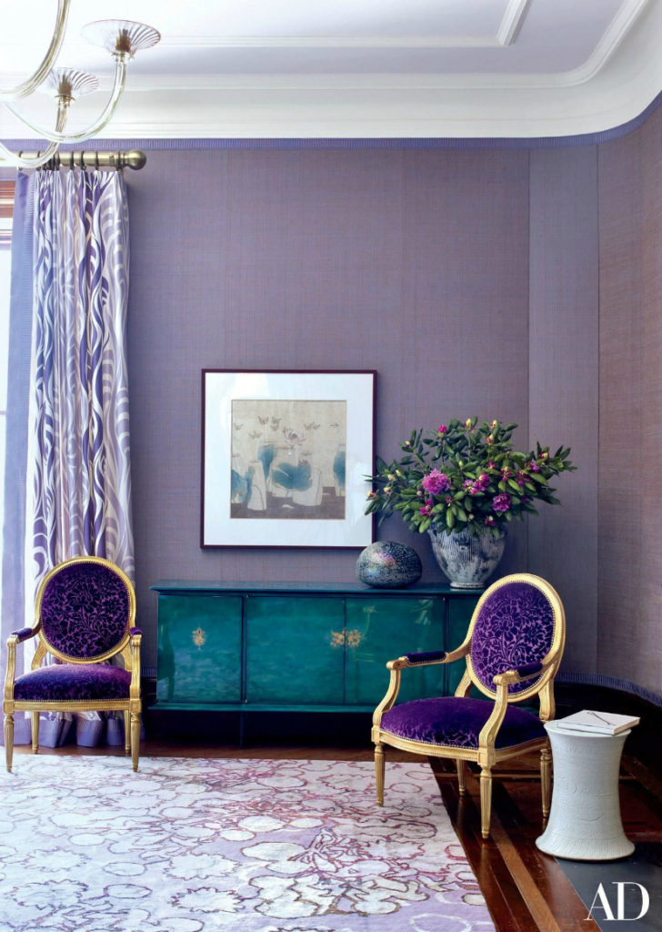
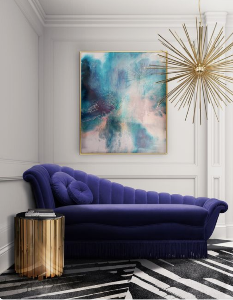
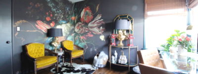
This year Pantone went bold with their 2018 Color of the Year, Ultra Violet 18-3838. It is a color that has been used mostly in high fashion interior design….the sort of design you would see in the likes of Architectural Digest, House Beautiful, Elle Decor to name a few. This is not a color that is for the faint of heart or for the person without some major design skills to use it boldly, but it certainly isn’t a color that anyone should be afraid of in small doses.
It reminds me of the LA skyline at dusk…when the sky is just about to turn black and resonates with that purplish navy color that has a thousand sparkling lights against it. In a more urban sense, it makes me think of some of the beautiful graffiti art murals that you see throughout town.
I am a girl who loves deep saturated color, as you saw in my office design and this vibrant blue purple reeks regality and fun. It’s a color that inspires feelings of abundance when used right. When paint companies choose a color, they are solely thinking about design. When Pantone chooses a color of the year, they are thinking of ALL of the artists who will be using the color and ALL of the media in which they will use it come into play. This year’s vibrant blue purple has a regal edge with a dose of fun and inspires feelings of abundance. It gives a sense hope and happiness along with a feeling of abundant luxury and couldn’t we all use a little ‘a’ that right now?
Pantone’s Ultra Violet in Interior Design
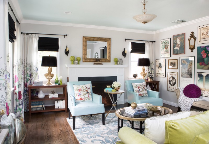
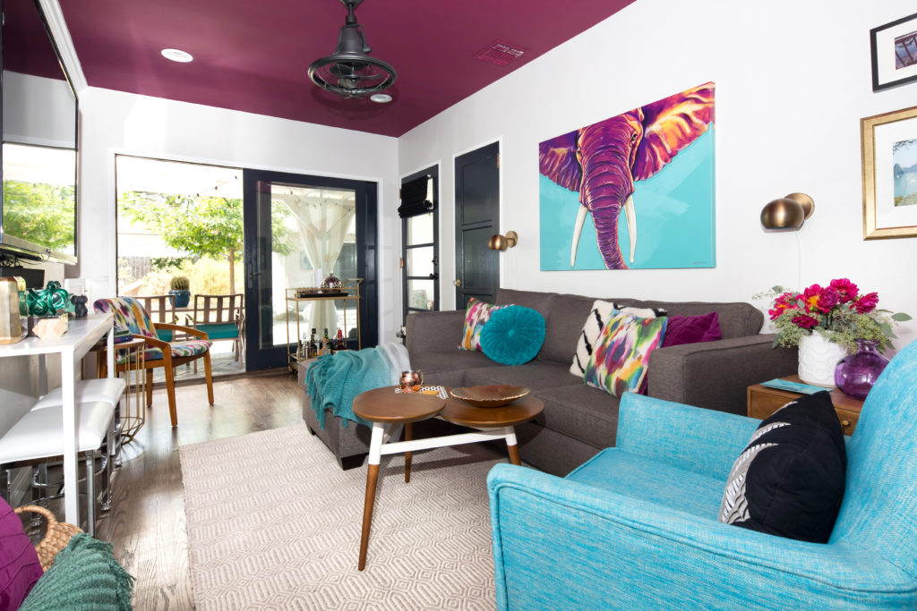
This is a color where creativity is a must, and really, sky is the limit. For a homeowner who wants to try this color in their design without the help of a designer, try using it in accessories & art, or with paint. You can still make a bold statement without a long term commitment. If you are so bold, try it on your ceiling, with coordinating shades of it in pillows and art. It will make a statement without a long term commitment. If you want a dramatic space with large doses of this color, I recommend seeking out a designer who has a sophisticated and avant garde aesthetic, or someone who can lightly pepper it in to your design.
Ways to Use It
- Use varying shades of it within the same room..
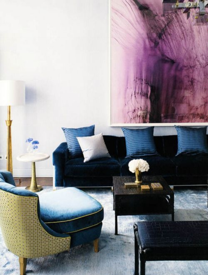
- Pair it with muted shades of green and deep saturated royal blue or mustard yellow.
- Ground it with with deeper, more solemn colors, black or muted earth tones, such as gray or putty.
- Pair it with other jewel tones.
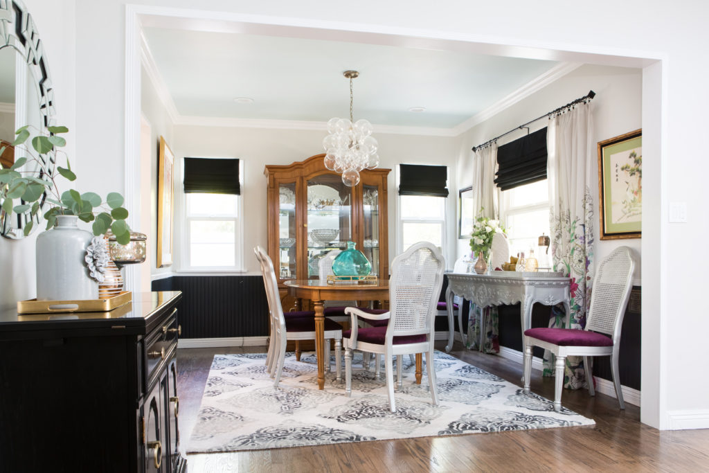
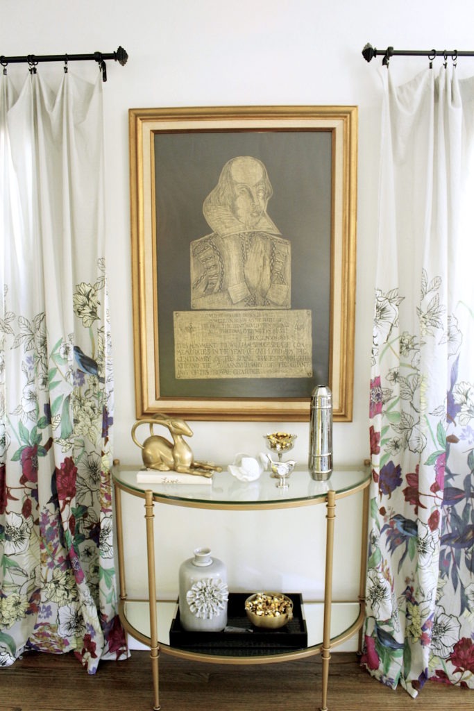
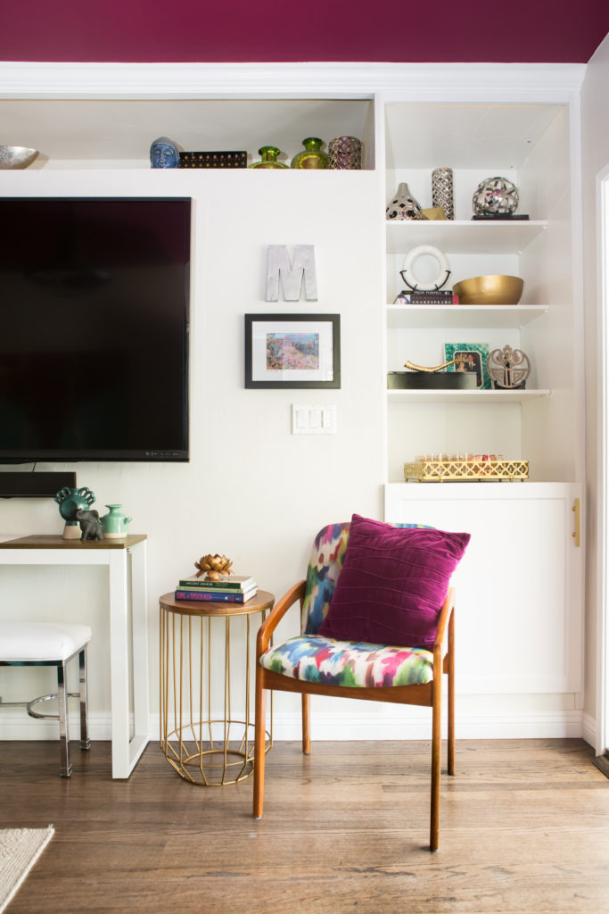
Here are some great examples of how it has been used in small and large doses.
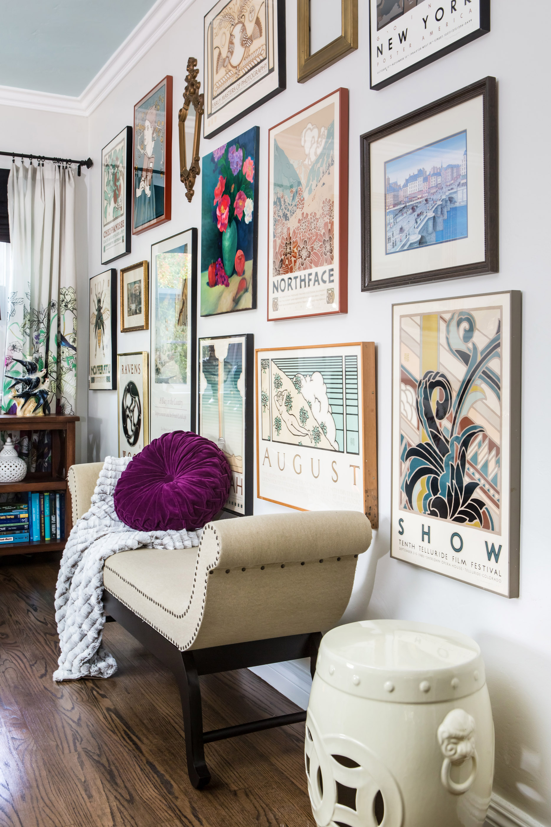
Marilynn Taylor
Marilynn Taylor
Marilynn Taylor
Marilynn Taylor
Marilynn Taylor
How I can help

P.S. If you want to get to know each other better before we work together, then the best way is to join my email list! You will be the first to know about any new products, new blog posts and videos. As a thank you, I will send you my 5 Design Hacks guide for free! PSS, I guard your email with my life….well maybe not my life, but you know what I mean. It’s safe with me!

